In its season-long quest to make (and sell) as many jerseys as it can after becoming the official NBA outfitter, Nike released the “City Edition” versions of each team’s uniforms on Wednesday. This addition to the uni rotation is the fourth, adding to the Association, Icon, and Statement jerseys.
The gist is that they represent aspects of the team’s locale, architecture, history, or anything else that sounds inspirational and is a cloaked way to say, “Buy these jerseys.”
The collection has some huge hits and a few misses. Here are some of the best (and worst), with commentary from our own NBA Slack, where this was a lively topic of conversation:
Three Shades of Gray
Minnesota
I get it. The icy north. It’s not that exciting, but then again, the Minnesota cold isn’t that thrilling either. Given the neon-green bravado of the Wolves’ Statement jerseys, this feels just about right.
Cleveland
Here’s where gray falls flat. The Cavs’ jerseys are already going to disappoint merely for having “The Land” on them, but this weird combination of muted gray with off-brand Pacers yellow is rough. But hey, apparently LeBron had a hand in the design. It’s a good thing Nike is making a new set of these each year, in case, well, you know.
Ringer Slack opinion (via Rodger Sherman): “the Cavs’ jersey is supposed to resemble this statue”
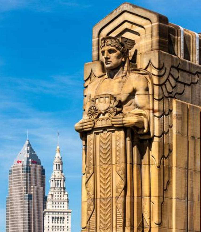
We can leave it at that.
Boston
I’m not sure the gray works here, either, but Boston gets points for incorporating the parquet-floor design into the fabric.
Keep It (Too) Simple
Brooklyn
So very Nets. So very Brooklyn.
Detroit
Given that the Pistons’ main colors are brighter, there was more to play with here, but this is just fine.
Ringer Slack take (via Pistons fan Shaker Samman): “The Motor City ones are baaaaad.”
Memphis
To say nothing of whether or not the inspiration works, I find myself respecting the commitment to this all-white look. It’s a nice complement to the Grizzlies’ powder blue.
Philadelphia
I like so much about the rest of this jersey that I am willing to put aside the fact that they couldn’t quite commit to the bit of having a cursive font.
Ringer Slack take (via art director David Shoemaker): “That Sixers font continues to be trash.”
Washington, D.C.
Very dramatic video, very underwhelming jersey. Bring back the Stars & Stripes.
Ringer Slack take (via Wizards fan Donnie Kwak): “At least they’ll hit the sale rack quickly.”
[Insert Clapping Emoji Here]
Charlotte
Sure, the Hornets have two vibrant colors to work with, but it’s almost like they know how to do this better than anyone.
Milwaukee
I love everything about these.
Miami
The Miami Vice inspiration, the colors, the font — it’s all perfectly Miami, the version of Miami we see in the movies.
Ringer Slack take (via Sherman): “the as-of-yet unofficial Miami jerseys are all-time greats”
Golden State
There’s a lot going on here, but the attention to detail alone is enough to warrant a high ranking. The inspiration is actually logical. Of course, the Warriors were also going to have one of the best jerseys.
Ringer Slack opinion (via Kings fan Riley McAtee): “it really hurts me a little bit how good Golden State’s jerseys are.”
Weird Inspiration
Orlando
The Magic must have logged on to Google Earth, took a screenshot, and then put it on a jersey. The inspiration description is even better: “The edges of light bordering our universe reveal a vastness greater than our imagination.” That’s how a Ken Burns doc on space would start, with Morgan Freeman narrating.
Ringer Slack take (via designer Matt James): “It’s about everyone in Orlando looking up at the stars dreaming of getting out of Orlando”
Los Angeles Lakers
Snakeskin, black, gold, Kobe-inspired. These look cool, but at some point, you gotta really say goodbye to Kobe, right? Right?
Ringer Slack take (via senior editor Justin Verrier): “Kobe is now the Stuff the Magic Dragon of the Lakers.”
Oklahoma City
These are supposed to represent the team, which is “fast, bold and dynamic,” while also displaying a sunset of sorts and “the forces of nature that exist both on and off the court.” Is this actually a subtweet to Russell Westbrook?
Ringer Slack take (via Kevin O’Connor): “I can’t get over how much the OKC jersey looks like Ziggy Stardust”
Sacramento
I will never be upset with the use of powder blues for any uniform, so I’m biased here, but as Riley McAtee points out, there’s no connection or relation to the city of Sacramento. They should have asked Greta Gerwig for inspiration.
Dallas
These are supposed to represent the downtown Dallas skyline, while not actually showing any part of the Dallas skyline. Great job, everybody.
There’s a Lot Going on Here
Portland
Black plaid with bright red. It’s very hipster, which is fitting, but also honors the late Blazers head coach Dr. Jack Ramsay for his unique style.
San Antonio
These look like a mess, and the Spurs had so much historical, sartorial greatness to work with, so these are ultimately disappointing.
Indiana
A race car design, a two-sided front, a number inside a circle. The Pacers tried to do a little too much.
New York
From this picture (and if these are official), it looks like the orange on the sides is different from the orange surrounding the logo. I love the neck outline, but one shade of orange would have been enough.
Ringer Slack take (via Knicks fan Danny Heifetz): “Even though this feels 80 percent of the way there, that’s more than I ever hope to get from the Knicks”
There’s Not Enough Going on Here
Denver
I will keep saying this until it’s done: Bring back the powder blues.
Toronto
We get it, you’re in the North. How about using some of the vintage colors and pinstripes from the Raptors’ old jerseys? Technically, dinosaurs are part of the team’s history.
Houston
The Chinese letters on the front of the jersey are a cool touch, but they basically took the red home jerseys and simply added that without alternating the color, or even going back to their retro kits. I know the the Rockets color scheme has been simplified to a red and white combination, but it feels like there was the potential for something with a little more spice.
Atlanta
That this is one of the less-wild designs by the Hawks since their new branding says a lot. The font screams “Give me a Tron sequel” while the tire marks (?) suggest a literal different direction. And yet, these will probably look cool on the court.
The Ones That Look Like Other Teams’ Jerseys
Phoenix
Speaking of purple, I’m all for using more of this color, and I’m certainly for honoring Hispanic heritage in Arizona with “Los Suns,” but these give me a slight Lakers look I cannot shake. Use the orange!
New Orleans
The Pelicans’ purple lies somewhere between too much and maybe just enough, which sums up many of the franchise’s moves of the last few years. The only issue: Anthony Davis wearing Lakers colors might make Pelicans fans sick.
Los Angeles Clippers
Utah
I get the inspiration, but these look just like the sunrise jerseys for the Houston Astros and are more appropriate for Phoenix. I respect the boldness, though.
Chicago
These jerseys are excellent, and while they harken back to Michael Jordan’s early years, they also emanate Clippers vibes.